")
Social Media
Presence━ Dr. Nadon Qafa
Social Media
Presence
━ Dr. Nadon Qafa
Dr. Nadon Qafa is an esteemed Albanian ophthalmologist, specialized in eye surgery, with a decade and a half long practice in the field. For most of his career, he has been a part of the team at American Hospital, where he treats everything from simple eye infections to cornea diseases.
His lifelong mission is to help his patients regain their normal sight, thus completely transform their lives in a positive and meaningful way.
Main Challenge
Broadening the impact
He came to the Digita Team with a clear purpose ━ he wanted his positive impact to reach a wider audience through social media and increase his digital footprint.
Beyond just his patients, he wanted to educate his audience on the importance of eye health, the best practices to maintain it, and assure them that there’s a solution for most eye diseases out there.
The main goal for us was to channel his valuable and unique messages to several targeted audiences who needed to receive them, and create a visual template that would define his brand.
The Solution
Finding a unique voice
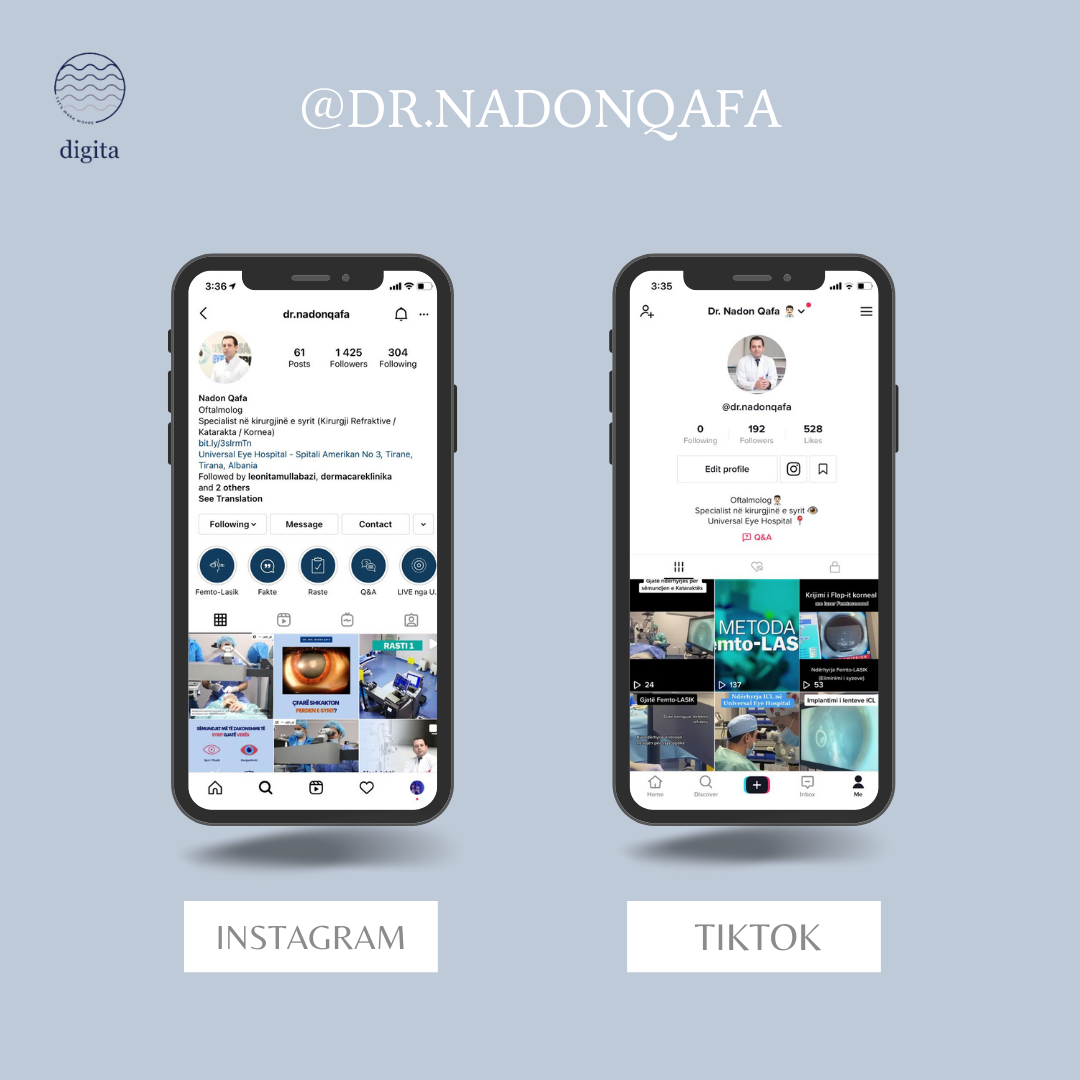
We decided to focus our client’s social media presence on three key elements: our client’s expertise and passion about what he does, the patients whose lives he has changed, and keeping it all educational for our audience. First, we unified the information we received in one clear, professional, yet empathetic voice, making sure our client’s expertise, as well as personality, shows throughout. We decided that the best way to speak to the audience is directly and openly, in first-person. We created calendars that featured a diverse type of content in both of the platforms we decided to work with: Facebook, Instagram, and TikTok. Shifting the focus from our client to his patients, we gave the audience the opportunity to engage with his profiles through photos, videos, infographics, private messaging, and more.Visual Identity
Minimalist Design
We did some experimenting with the visual design at first, in order to understand what the audience interacts with the most. We came to the conclusion that a minimalistic design, paired with a combination of warm and cold colors fit our client’s brand best. Keeping things simple, we incorporated a lot of white, representing the purity and cleanliness of a doctor’s work. To go with the colors of medical uniforms, we picked a light baby blue so that it doesn’t contrast with the pictures too much. For the purpose of adding some warmth and friendliness, we often incorporate some light orange in our designs.